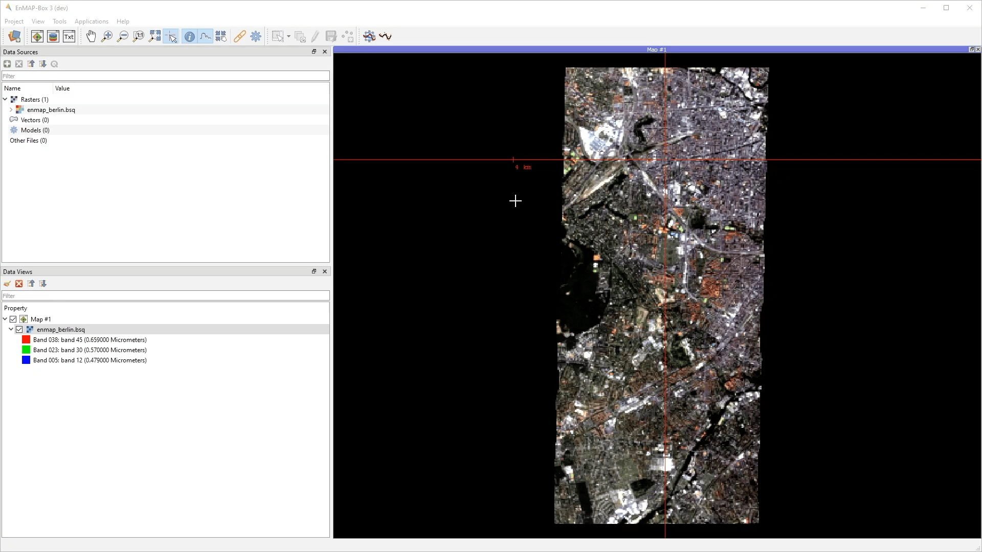
Tools
Add Product
The Add Product menu allows to import satellite products into the EnMAP-Box. It is also possible to drag&drop products from the file explorer (e.g. Windows Explorer). The different import algorithms assign proper metadata like wavelength, band names and data offset and scale, resulting in analysis ready raster data.
Usage
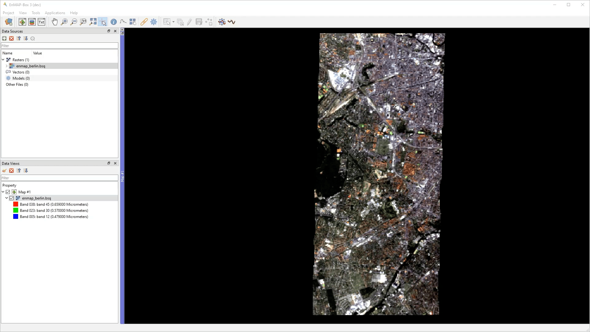
Choose the product type from the Project > Add Product menu.
Select the associated (metadata) file and Open in Maps View.
Adding multiple Map Views.
Add Web Map Services (WMS)
The Add Web Map Services (WMS) menu allows to add predefined WMS to the Data Sources panel:
- Usage
Choose a WMS from the Project > Add Web Map Services (WMS) menu.
Add the WMS to a Map View.
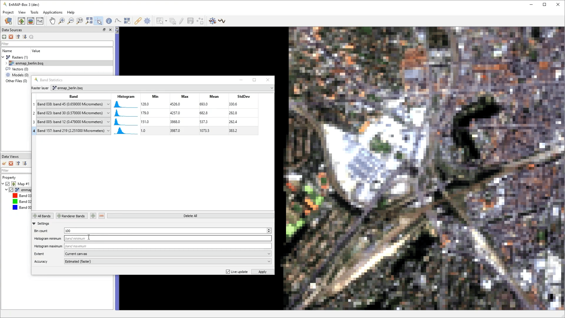
Band Statistics
The Band Statistics tool reports band histograms and basic statistics like min, max, mean and standard deviation.
- Usage
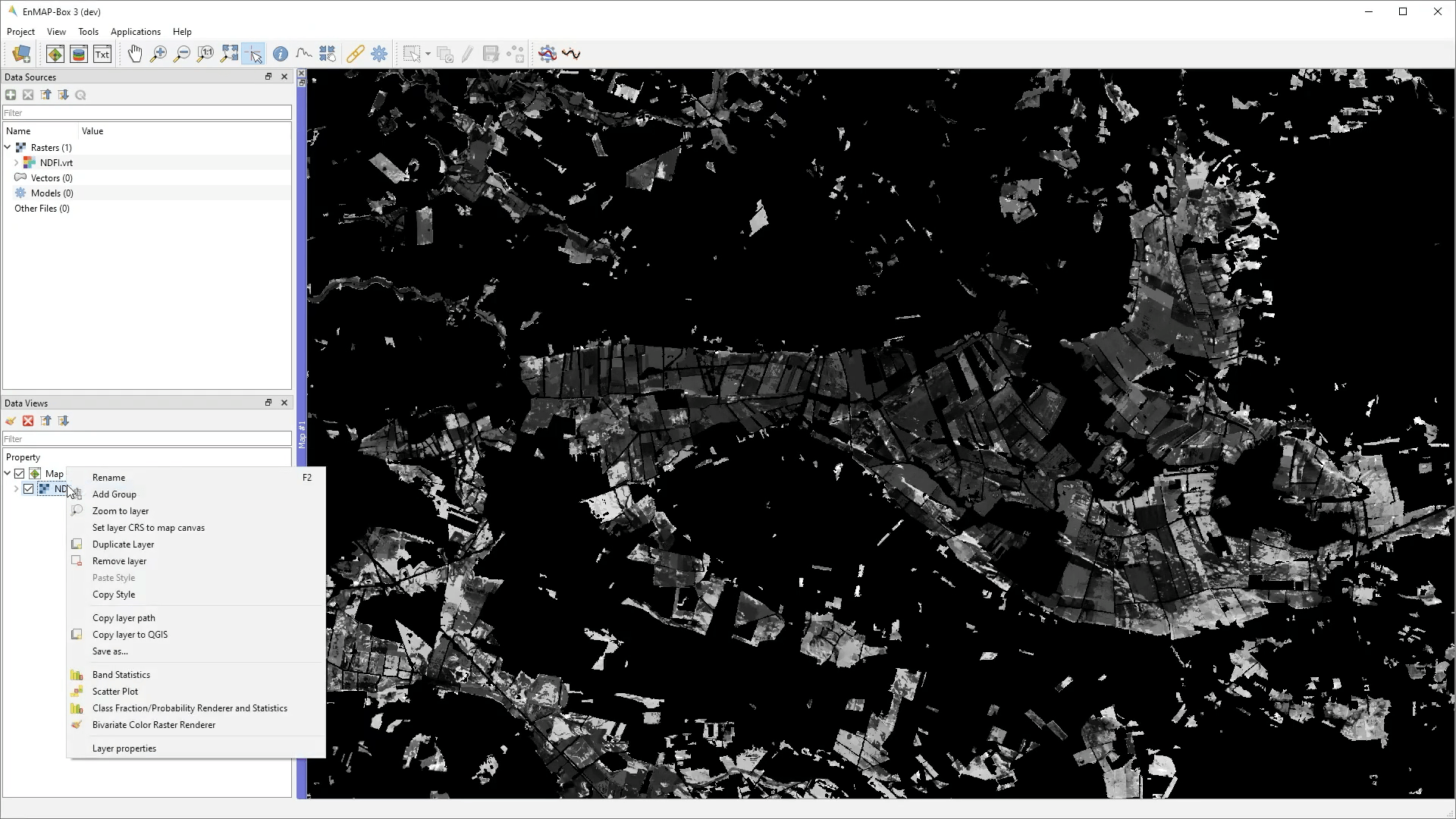
Start the tool from the Tools > Band Statistics menu or from the layer context menu inside the Data Views panel.
Select a raster layer and add some bands.
Interactively explore the map.
Bivariate Color Raster Renderer
The Bivariate Color Raster Renderer allows to visualize two bands using a 2d color ramp. Find a mapping example here: https://www.joshuastevens.net/cartography/make-a-bivariate-choropleth-map/
- Usage
Start the tool from the Tools > Bivariate Color Raster Renderer menu or from the layer context menu inside the Data Views panel.
Select a raster layer.
Select two bands and select/define a color plane.
Interactively explore the map.
Class Fraction/Probability Renderer and Statistics
The Class Fraction/Probability Renderer and Statistics tool allows to visualize arbitrary many fraction/probability bands at the same time, using a weighted average of the original class colors, where the weights are given by the class fractions/probabilities.
- Usage
Start the tool from the Tools > Class Fraction/Probability Renderer and Statistics menu or from the layer context menu inside the Data Views panel.
Select a class fraction layer or a class probability layer.
Select approriate class colors or paste a matching style from another layer.
Interactively explore the map.
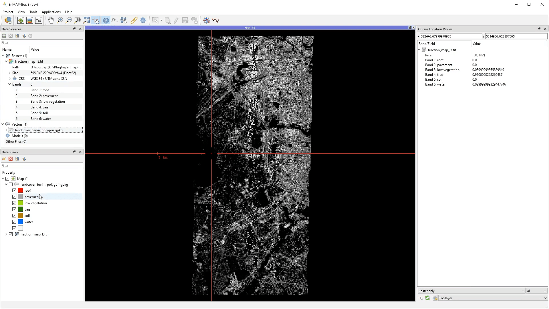
Note that the visibility of individual classes can be turned on and off.
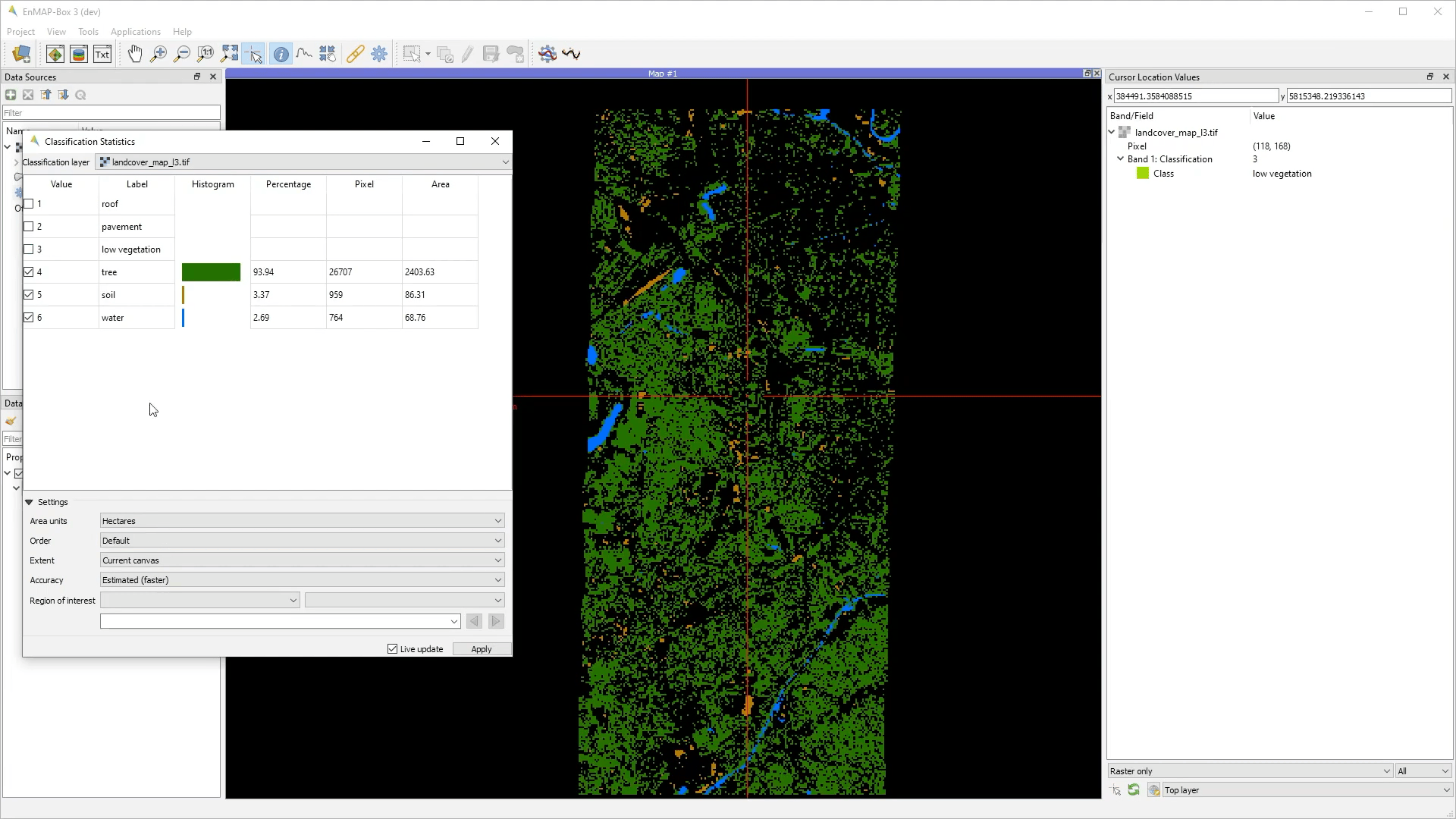
Classification Statistics
The Classification Statistics tool reports class histograms and area covered in percentage, pixel and map units.
- Usage
Start the tool from the Tools > Class Fraction/Probability Renderer and Statistics menu or from the layer context menu inside the Data Views panel.
Select a categorized raster layer.
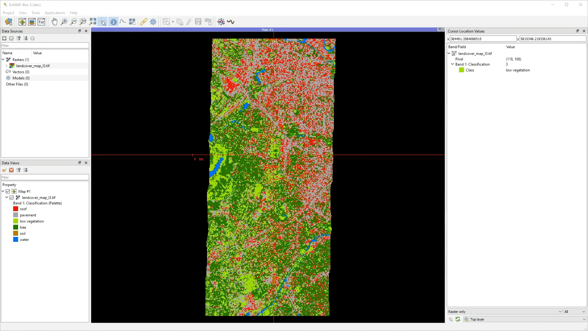
Tweak the settings according to your parameters and interactively explore the map.
CMYK Color Raster Renderer
The CMYK Color Raster Renderer allows to visualize 4 bands using the CMYK (Cyan, Magenta, Yellow, and Key/Black) color model. Find a mapping example here: https://adventuresinmapping.com/2018/10/31/cmyk-vice/
- Usage
Start the tool from the Tools > CMYK Color Raster Renderer menu or from the layer context menu inside the Data Views panel.
Select a raster layer.
Select CMYK bands and interactively explore the map.
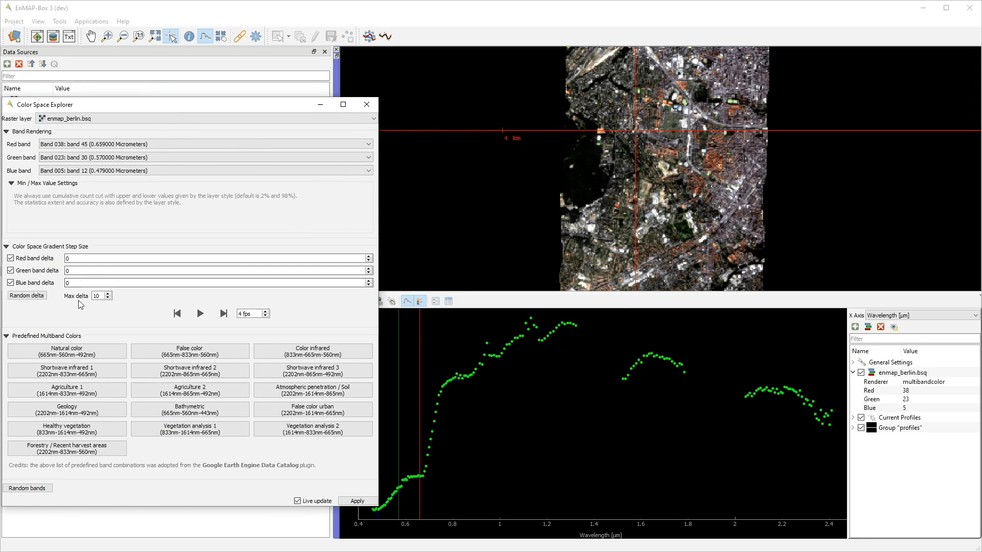
Color Space Explorer
The Color Space Explorer allows a) to select random and predefined RBG band combinations, and b) to animate RGB bands.
- GUI
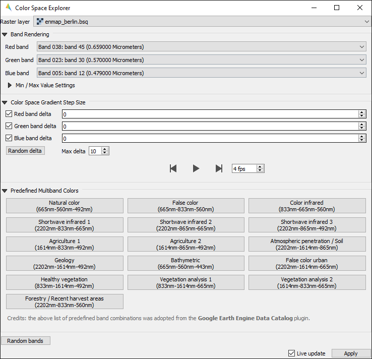
- Usage
Start the tool from the Tools > Color Space Explorer menu or from the layer context menu inside the Data Views panel.
Select a raster layer.
Select RGB bands:
manually
randomly
from predefined list of RGB band combinations
Animate bands using the Color Space Gradient Step Size settings and interactively explore the map.
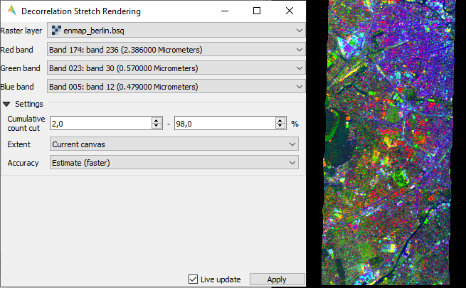
Decorrelation Stretch Renderer
The Decorrelation Stretch Renderer allows to visualize 3 band. It removes the high correlation commonly found in optical bands to produce a more colorful color composite image.
- Usage
Start the tool from the Tools > Decorrelation Stretch Renderer menu or from the layer context menu inside the Data Views panel.
Select a raster layer.
Select RGB bands.
Interactively explore the map.
- GUI
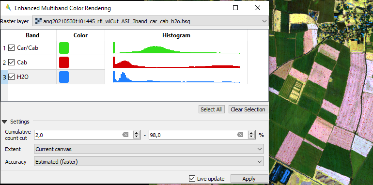
Enhanced Multiband Color Renderer
The Ehanced Multiband Color Renderer allows to visualize arbitrary many bands at the same time using individual color canons for each band.
- Usage
Start the tool from the Tools > Enhanced Multiband Color Renderer menu or from the layer context menu inside the Data Views panel.
Select a color for each band.
Interactively explore the map.
- GUI
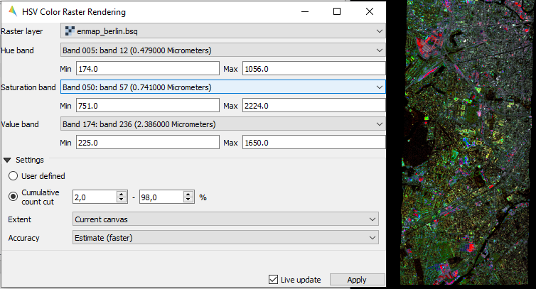
HSV Color Raster Renderer
The HSV Color Raster Renderer allows to visualize 3 bands using the HSV (Hue, Saturation, Value/Black) color model.
- Usage
Start the tool from the Tools > HSV Color Raster Renderer menu or from the layer context menu inside the Data Views panel.
Select HSV bands.
Interactively explore the map.
- GUI
Todo
Find a good dataset, that is comparable to the Global Landcover Dynamics 2016-2020 from GeoVille.
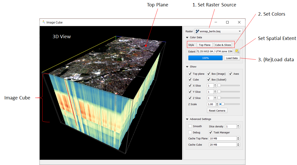
Image Cube
The Image Cube tool visualizes a raster image in an interactive 3D view:
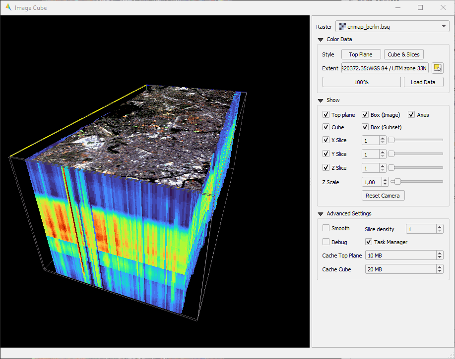
Select the raster image.
Specify the:
- Top Plane renderer. It can be any raster renderer known from QIGS, e.g. a Multiband
color renderer that shows the true color bands
Cube & Slice renderer. This must be a render that uses a single band only, e.g. a Singleband grey or Pseudocolor renderer. It will colorize the band-related pixel values of the 3D image cube and planes relating to the X, Y or Z slice.
Press Load Data to (re)load and render the raster image values.
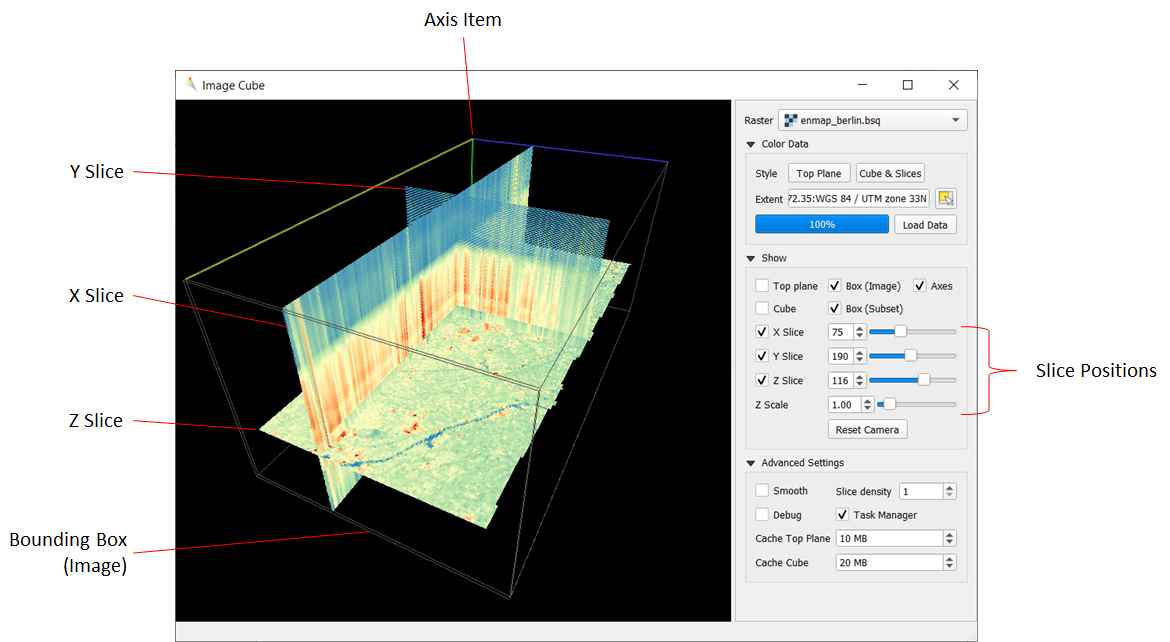
The 3D scene contains the following elements:
Top Plane - a raster layer for spatial orientation
Image Cube - a volumetric representation of the raster image, showing the raster bands on the z axis
X Slice - a slice along the raster’s X / column / sample dimension
Y Slice - a slice along the raster’s Y / row / line dimension
Z Slice - a slice along the raster’s Z / band dimension
Box (Image) - a 3D bounding box along the maximum image extent
Box (Subset) - a 3D bounding box to show the extent of the spatial subset that migh be used to focus on specific image areas
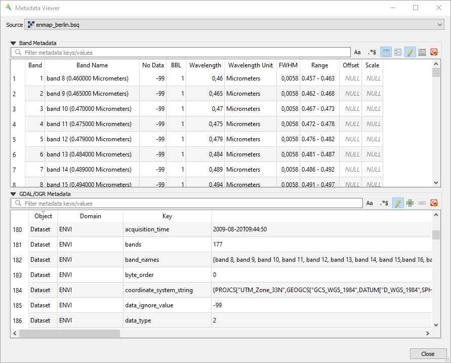
Metadata Viewer
The Metadata Viewer allows to view and edit GDAL metadata of a raster source.
- Usage
Start the tool from the Tools > Metadata Viewer menu.
Select a raster source.
View and edit metadata.
- GUI
Multisource Multiband Color Raster Renderer
Todo
WriteTheDocs (use FORCE TSI stacks with TCB/G/W)
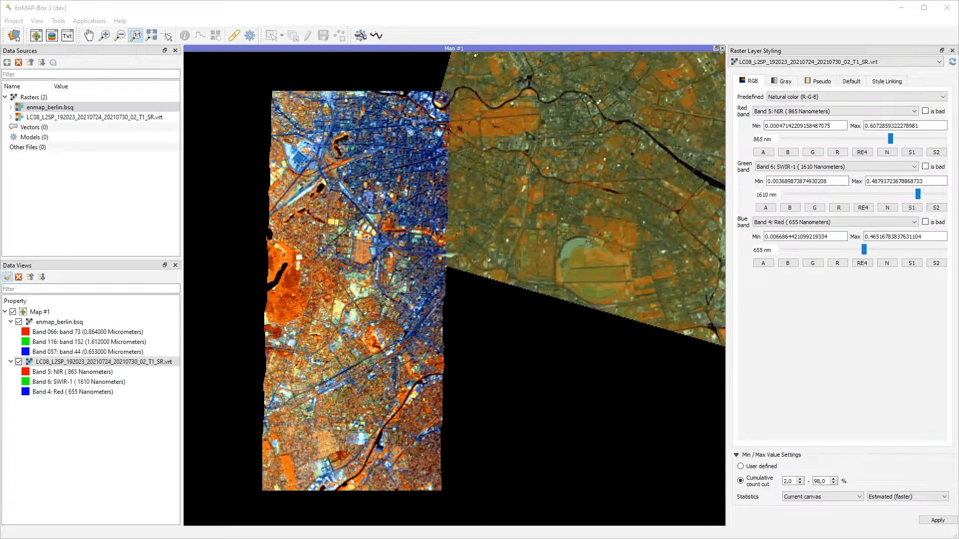
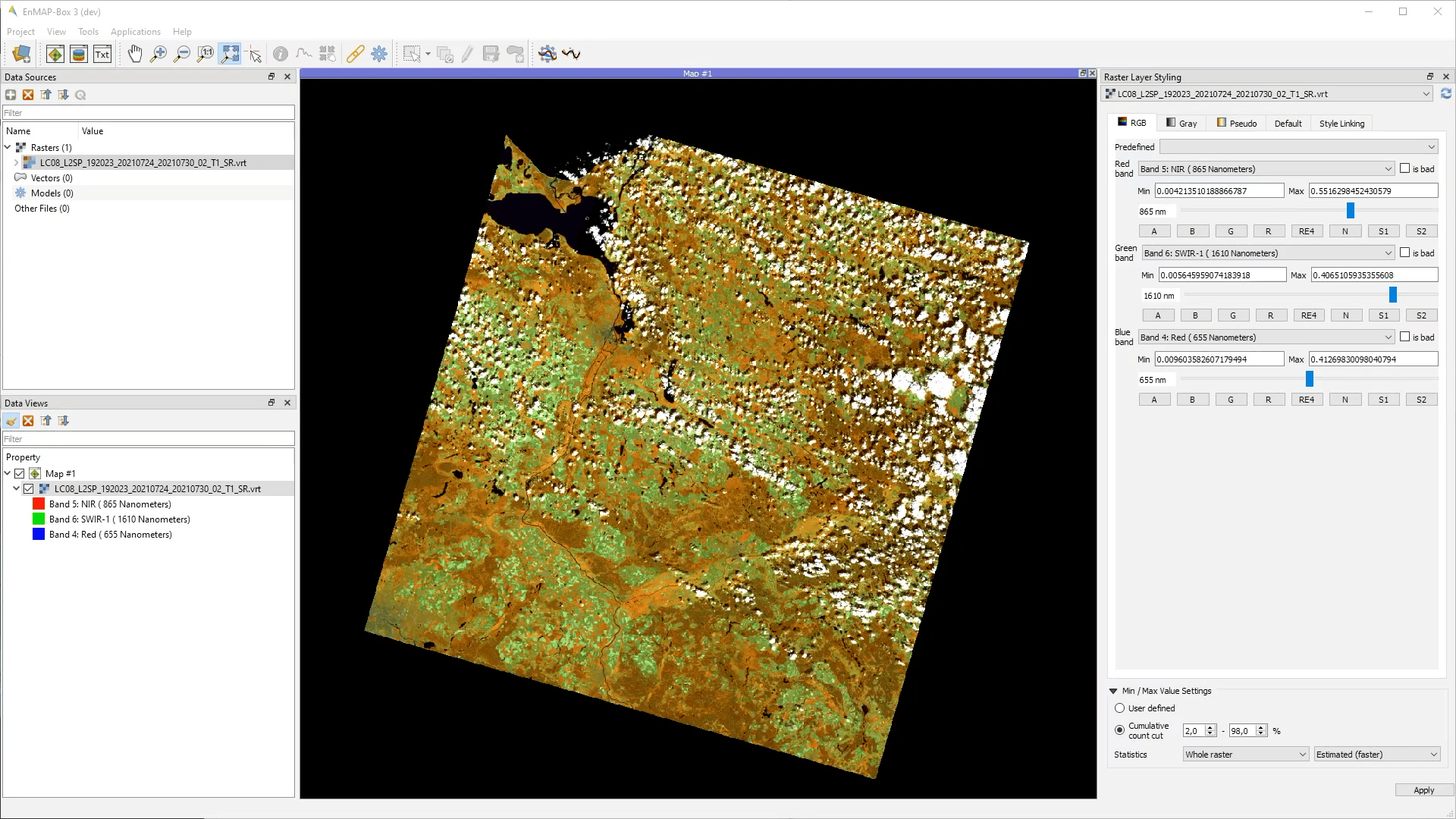
Raster Layer Styling
The Raster Layer Styling panel allows to quickly select a RGB, Gray or Pseudocolor visualizations.
- Usage
Show the panel via the View > Panels > Raster Layer Styling menu or click
 Open Raster Layer Styling panel in the Data Views panel.
Select a raster source. Adjust the parameters in the RGB Panel.
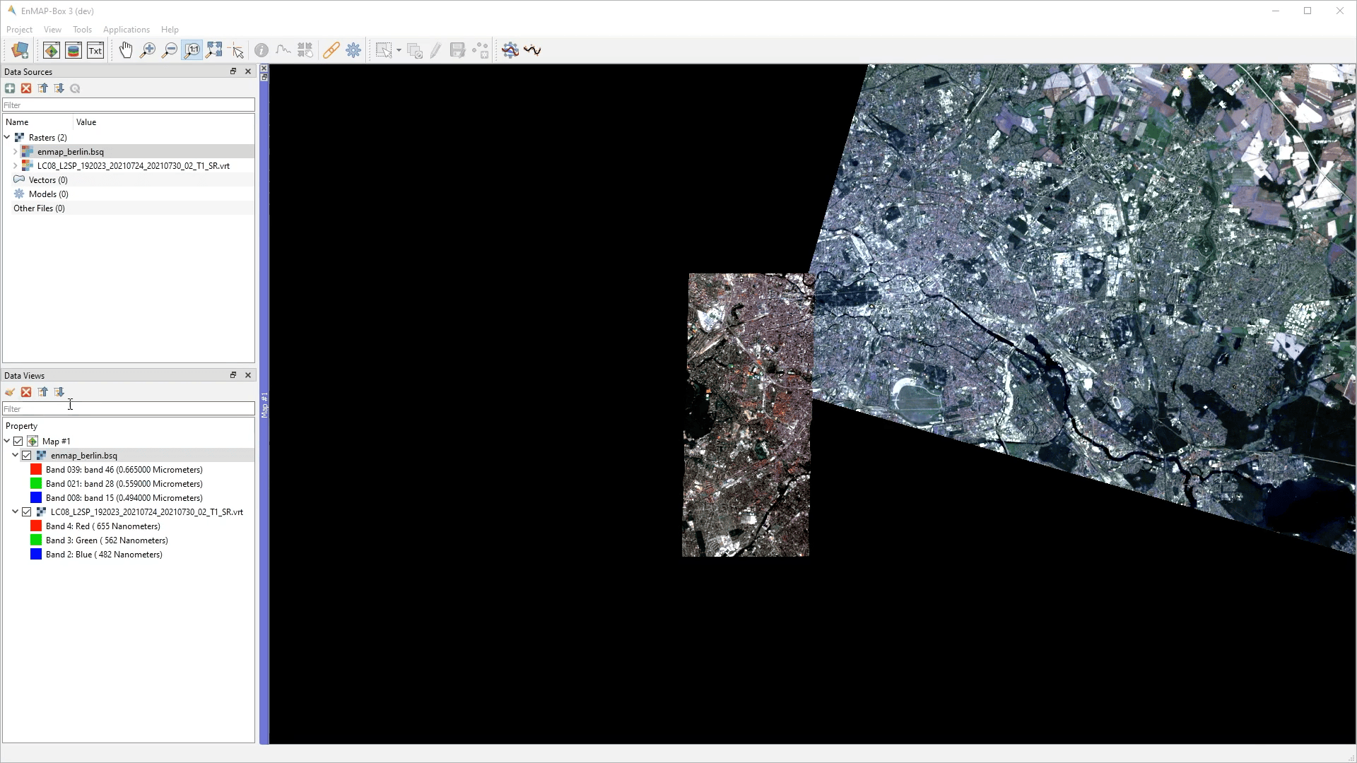
View and Adjust in GRAY/PSEUDO Panels
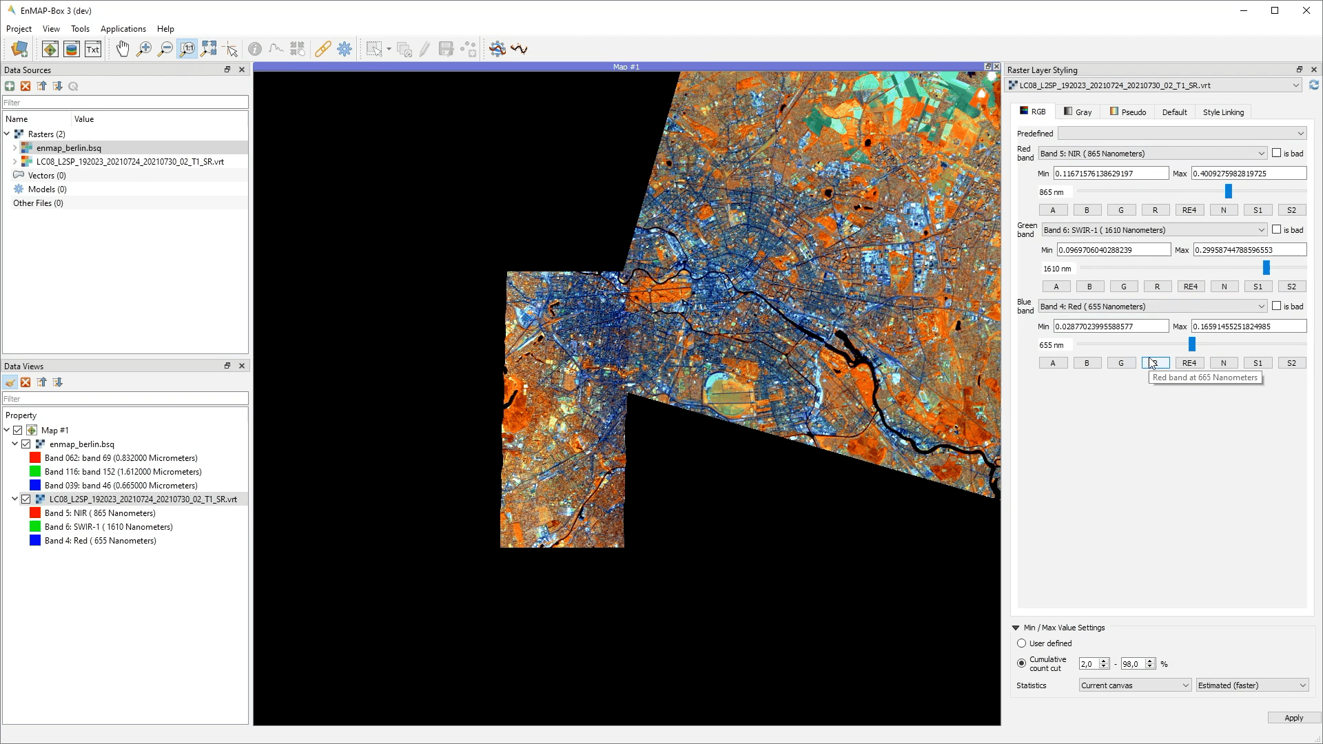
It also supports the linking of the style between multiple raster layer.
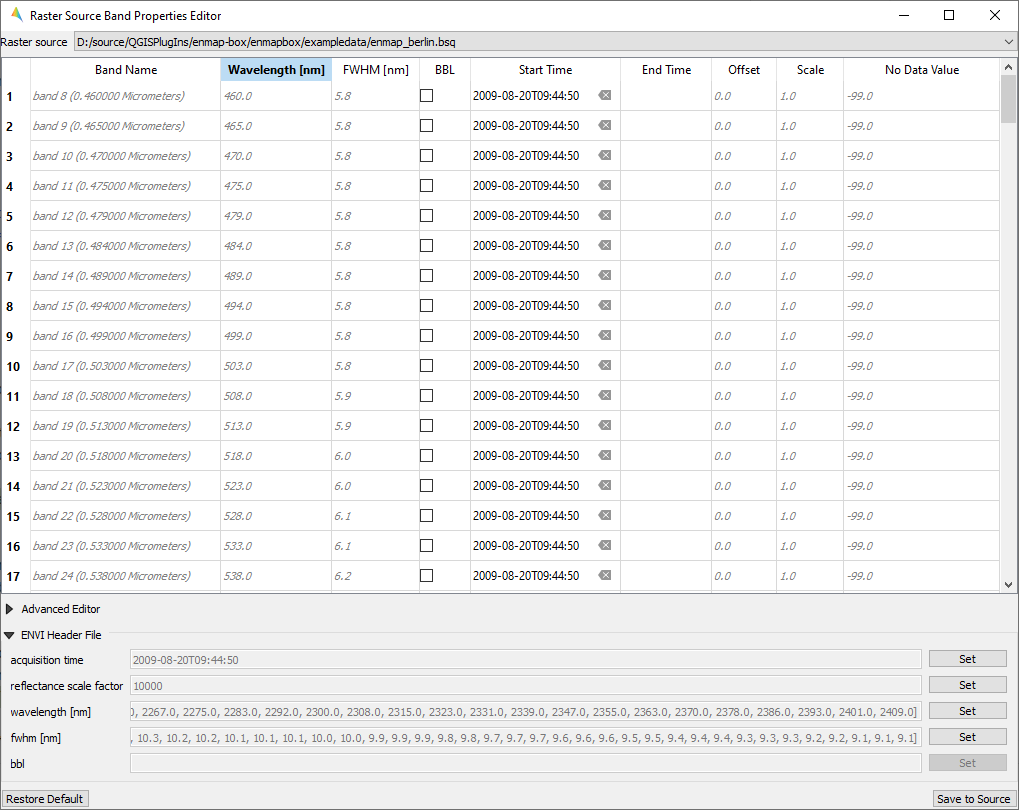
Raster Source Band Properties Editor
The Raster Source Band Properties Editor allows to view and edit band properties of GDAL raster sources, with special support for ENVI metadata.
- Usage
Start the tool from the Tools > Raster Source Band Properties Editor menu.
Select a raster source.
View and edit metadata.
- GUI
Reclassify
The Reclassify tool is a convenient graphical user interface for reclassifying classification rasters.
Specify the file you want to reclassify under Input File. Either use the dropdown menu to select one of the
layers which are already loaded or use the  button to open the file selection dialog.
Under Output Classification you can specify the classification scheme of the output classification which will be created.
You can import schemes from existing rasters or text files by clicking the
 button.
Use the
 button to manually add classes.
To remove entries select the respective rows and click the
 button.
So save a classification scheme select the desired classes (or use Crtl + A to select all) and click on the
 button.
Likewise, you can copy and paste classes by selecting them and clicking the
 Copy Classes
 Paste Classes buttons.
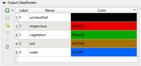
The table is sorted by the Label field in ascending order. The value in Label will become the pixel value of this class and can not be altered.
Double-click into the Name field in order to edit the class name.
Double-click into the Color field to pick a color.
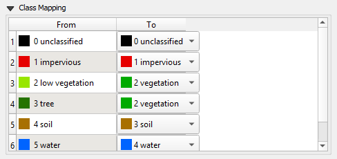
Under Class Mapping you can reassign the old classes (From) to values of the new classification scheme (To)
Specify the output path for the reclassified image under Output File
Click OK to run the tool.
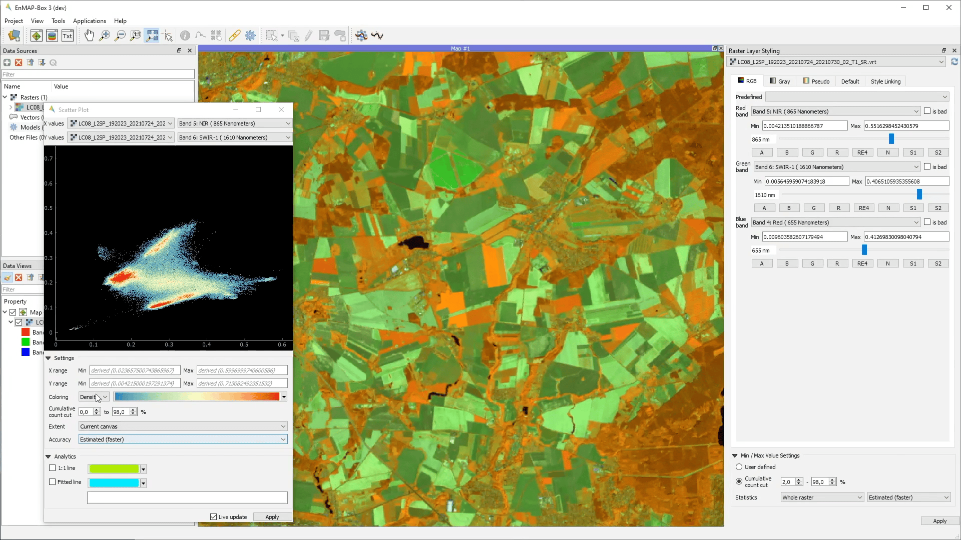
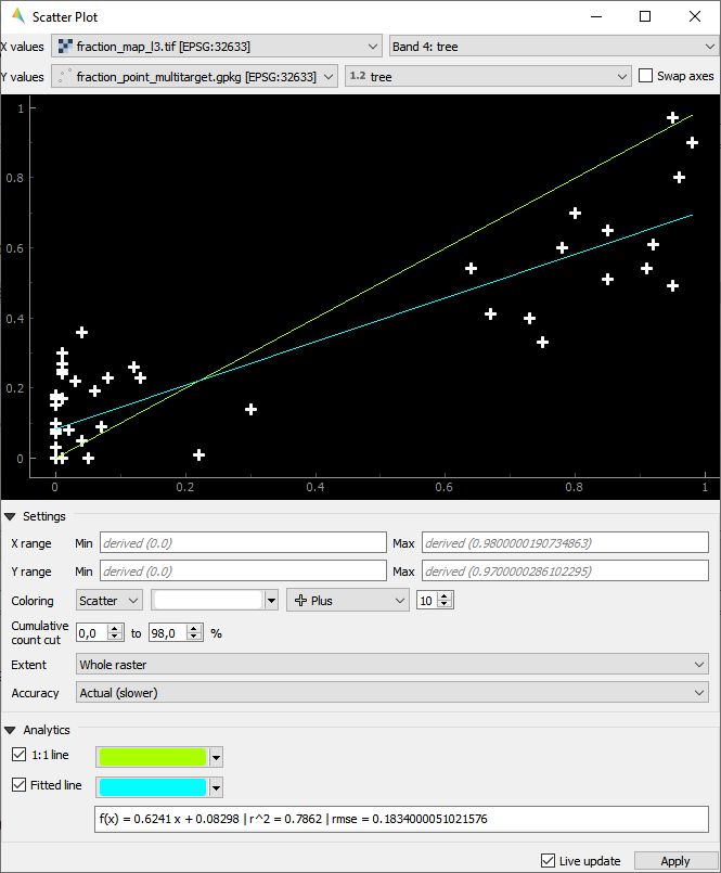
Scatter Plot
The Scatter Plot allows to plot two raster bands, or a raster band and a vector field against each other. The visualization of both, denstity and scatter is supported.
Plotting Raster Band vs. Raster Band
When plotting raster data against each other, we usually want to display the bin counts as colorized density.
- GUI
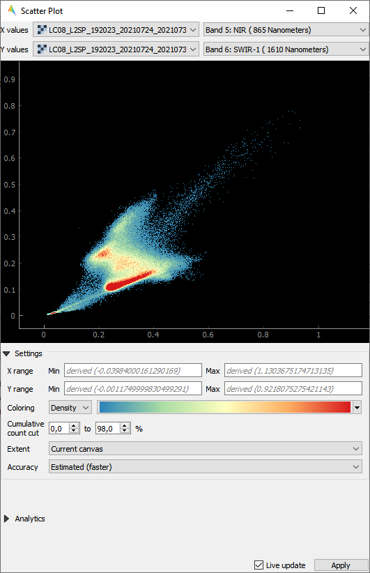
- Usage
Start the tool from the Tools > Scatter Plot menu or from the layer context menu inside the Data Views panel.
Select two raster layer bands used for x and y values.
Adjust the Map View and explore the plot.
Select Density option for Coloring and choose a color ramp.
Tweak the settings according to your needs and explore the plot.
Plotting Raster Band vs. Vector Field
The tool can also be used to plot raster data versus vector attribute values, e.g. for accuracy assessment of quantitative maps.
- Usage
Start the tool from the Tools > Scatter Plot menu or from the layer context menu inside the Data Views panel.
Select a raster layer band used as x values, and vector layer field used as y values.
Select Scatter option for Coloring, choose a color and a symbol.
Active 1:1 line and Fitted line in the Analytics section.
- GUI
Virtual Raster Builder
See https://virtual-raster-builder.readthedocs.io/en/latest/